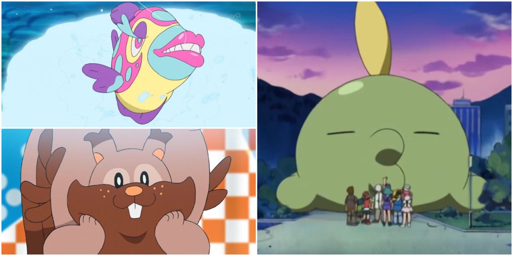
Highlights
- Some Pokemon designs are uninspired, lacking purpose and creativity.
- Human-like Pokemon designs, such as Mr. Mime and Jynx, are generally disliked and out of place.
- Certain Pokemon, like Probopass and Eiscue, have design choices that are widely regarded as problematic or strange.
The Pokemon series is home to some of the finest creature designs. If not for the great mix of creativity and simplicity, Pokemon would not nearly be as successful. The past 25 years have given some of the most iconic designs for video game characters, and Game Freak deserves credit for that.
Pokemon GO: The 20 Best Looking Shinies In The Game
These shinies are the kinds that will turn the heads of any trainer if they see one in Pokemon GO.However, when so many Pokemon are required to fill a Pokedex, there are going to be a few misses. Some designs are uninspired or lazy, and they seem to just fill the space between the good designs. Despite what some fans may think, the worst designs aren't the weird ones. The worst designs are the ones that simply have no purpose. They don't take any risks or creative spins. In some cases, they're outright just not appealing. This isn't something every person is going to agree on, but these designs are widely regarded as far from spectacular.
Updated on February 16, 2024, by Ben Painter: There are now over 1000 Pokemon in the franchise, and some, like Charizard, Tyranitar, and Galarian Rapidash, have a perfect design. But others leave a sour taste in the mouth. Pokemon Scarlet & Violet is no exception to this rule. It is worth noting that Paradox Pokemon have been excluded from this list, as they are meant to look weird and otherworldly. It simply is not fair to compare them to other standard Pokemon.
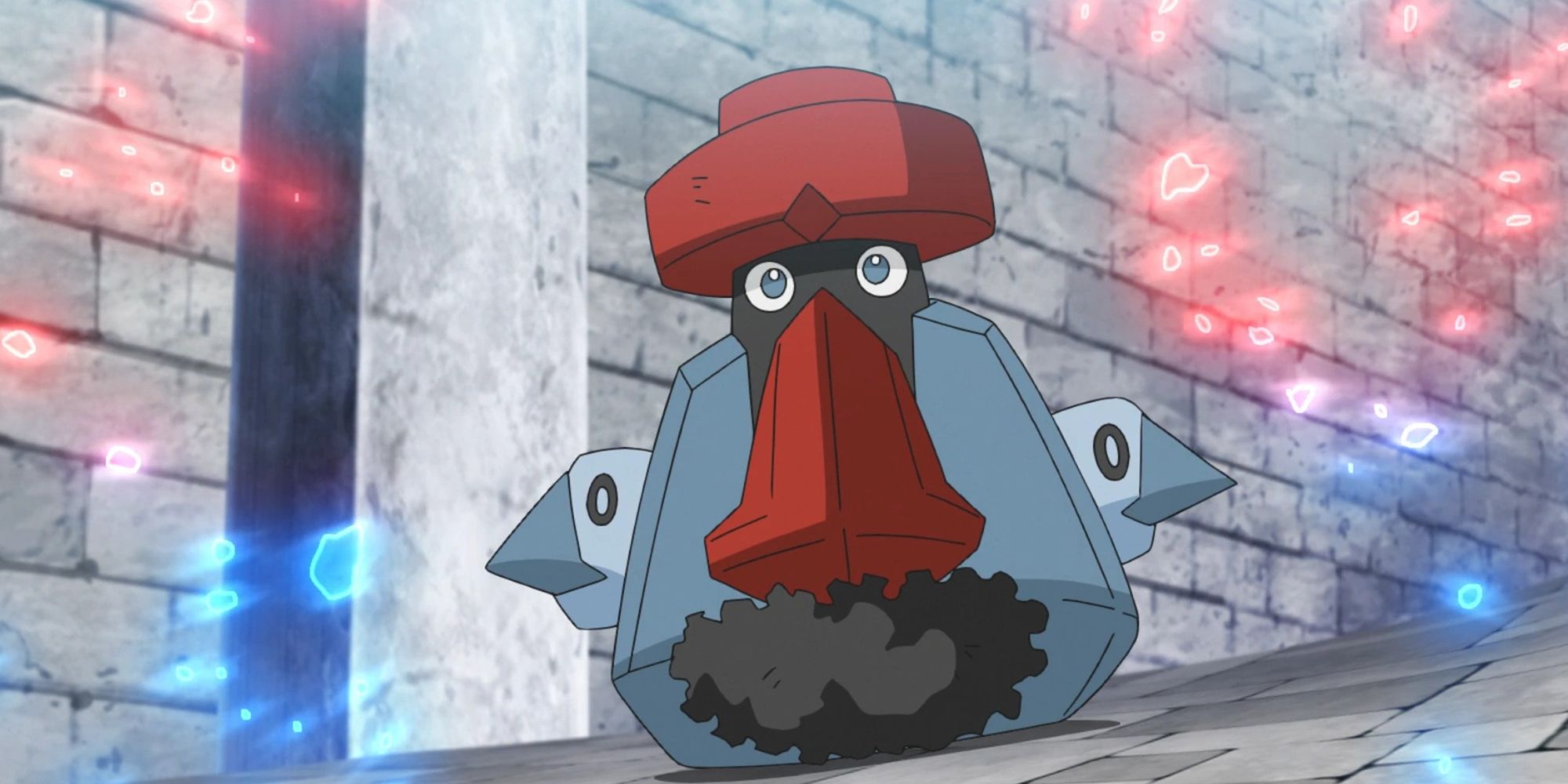
28 Probopass
The Mustache Needs To Go
- Generation 4
- First game introduced: Pokemon Diamond & Pearl
The pre-evolved form of Nosepass was first brought to fans in Generation 3, and it was not regarded as a bad design. But in the next generation, it received an evolution in Probopass, and it was disliked among fans. The mustache simply makes no sense on a Rock/Steel-type.
Its nose is its full gimmick, which can be understood, but the matching hat and the human-like eyes make for a hideous-looking Pokemon. This is without mentioning the potential negative racial stereotype that Probopass' design alludes to. It's a problematic and awfully designed Pokemon.
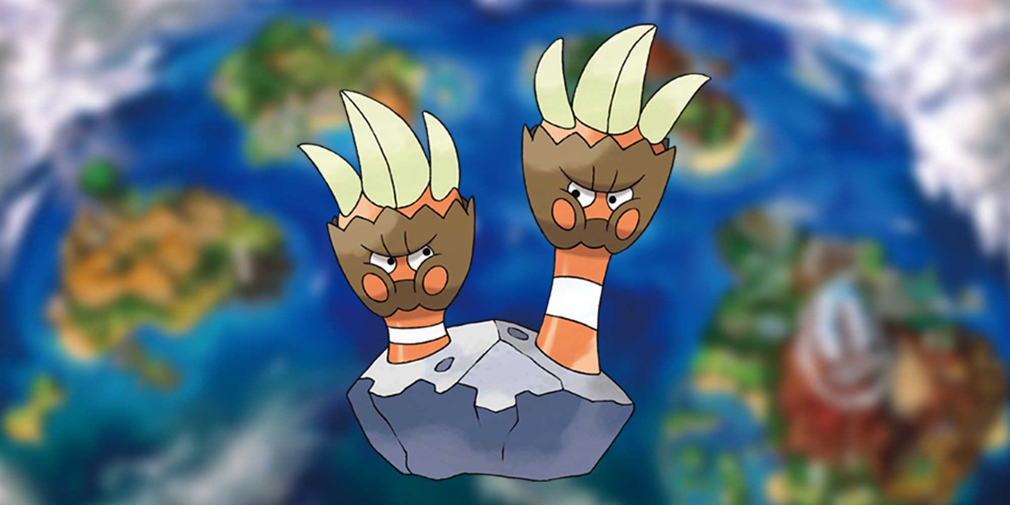
27 Binacle
An Angry-Looking Pokemon
- Generation 7
- First game introduced: Pokemon Sun & Moon
This Pokemon looks like something from The Last of Us. Binacle has two faces, which is just creepy. What makes it worse is that they also look like hands. A Pokemon based on a barnacle was always going to end in a nightmare-fueled way, as it isn't the prettiest of creatures on Earth.
The Fastest Pokemon of All Time
There have been plenty of speedy Pokemon over the years, but which ones are the fastest in Nintendo and Game Freak's franchise?What Binacle has going for it is its evolution. Barbaracle is a much better-designed Pokemon. The Rock/Water 'mon gains one face and looks more like a golem, standing on two feet. However, its four hands each have an eye on them, which is quite creepy. At least it is useful in battle with high defense, impressive attack, and a base stat total of 500.
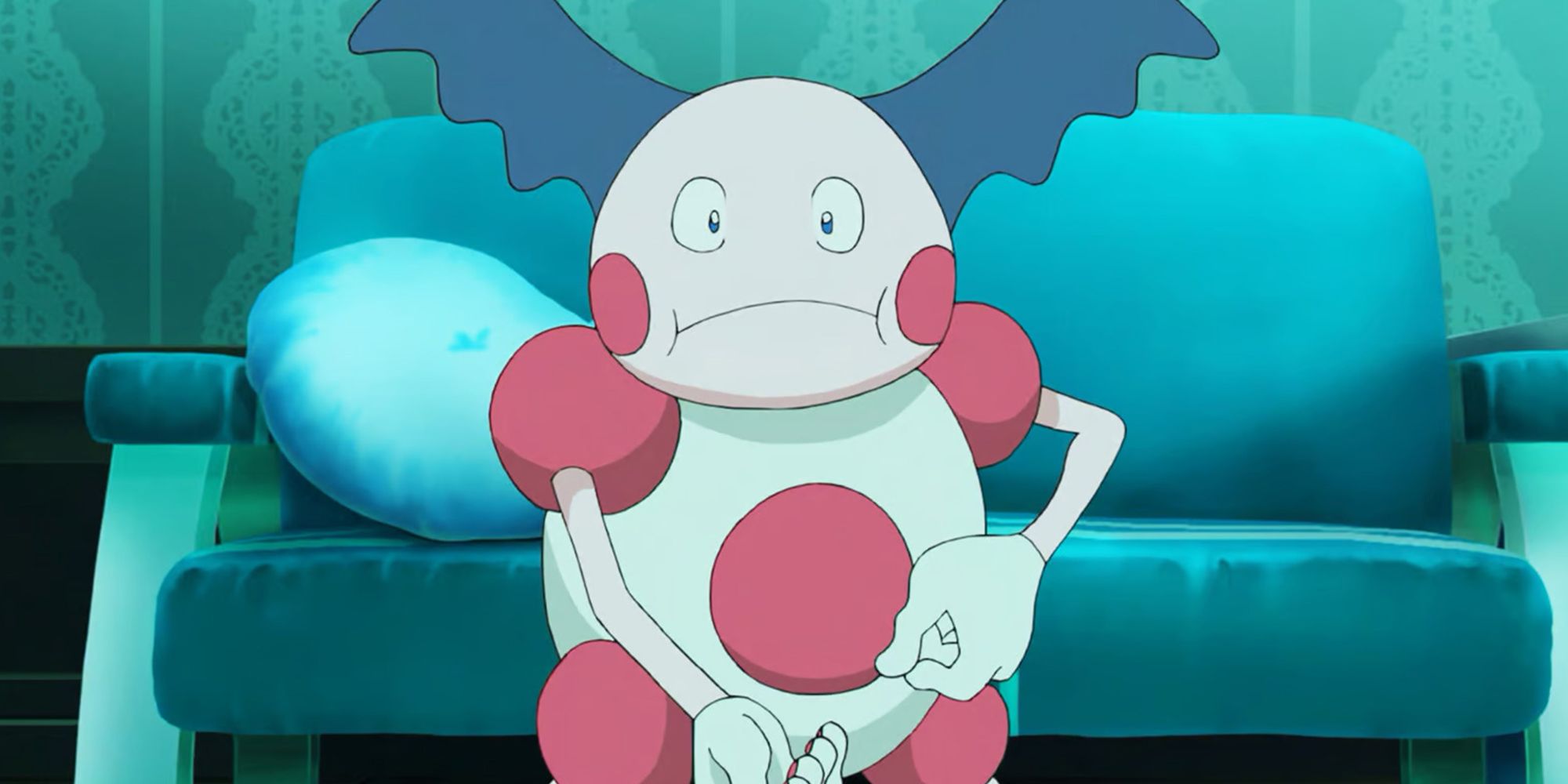
26 Mr. Mime
Clowns Are Always Going To Lose
- Generation 1
- First game introduced: Pokemon Red & Blue
Where should one start with Mr. Mime? Clowns are disliked by many across the world, and that's for obvious reasons. So why did Game Freak create a clown Pokemon? Mr. Mime is also a prominent feature in the anime, playing the role of Ash's mom's Pokemon, and it just looks so out of place among its animal-like peers.
Human-based Pokemon are never revered as the best Pokemon, and Mr. Mime is no exception. In the live-action Detective Pikachu movie, Mr. Mime makes an appearance with a more realistic look, and if fans have not had the pleasure of seeing this design yet, they should look with caution, as it may as well have been Pennywise the Clown.
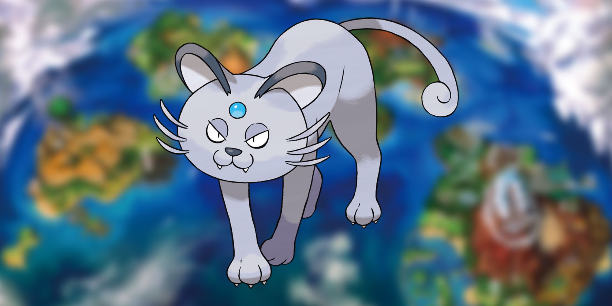
25 Alolan Persian
A Worse Version Of An Iconic Pokemon
- Generation 7
- First game introduced: Pokemon Sun & Moon
The Pokemon Persian is an iconic Pokemon, playing the role of the main villain's signature Pokemon. So it is understandable why Persian would receive a new form when Alolan forms were introduced in Pokemon Sun & Moon.
6 Useful Glitches Or Exploits In The Pokemon Series
Early Generation Pokemon games had their fair share of famous glitches, but while some were just annoying, others could actually benefit the player.This design falls flat on its face. Its face is too round and does not match the rest of its body. Making it a Dark-type was a good move, but Dark-types are meant to be evil-looking, and Alolan Persian even fails at that. It looks very different from its original counterpart, which kind of defeats the point of Regional Variants.
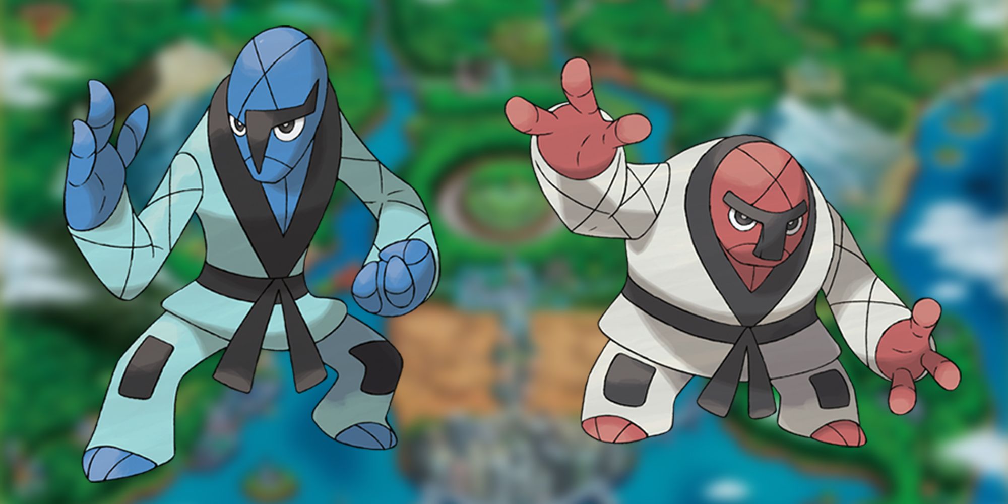
24 Sawk & Throh
Slightly Too Humanlike
- Generation 5
- First game introduced: Pokemon Black & White
As mentioned with Mr. Mime, human-looking Pokemon do not work well, and Sawk and Throh are perfect examples of why. They are even wearing clothes, which raises another question. Since these Pokemon are not seen without their karate outfits, it is assumed that the clothes are part of their skin.
Perhaps that is critiquing the design too much, but when discussing the lore of Pokemon, some fans need everything to make sense, and Sawk and Throh just don't. It is hard looking at the two Fighting Pokemon and not seeing Sesame Street's Bert & Ernie. There are several memes on the internet that highlight this similarity, and once one of them has been seen, it's very hard to forget.
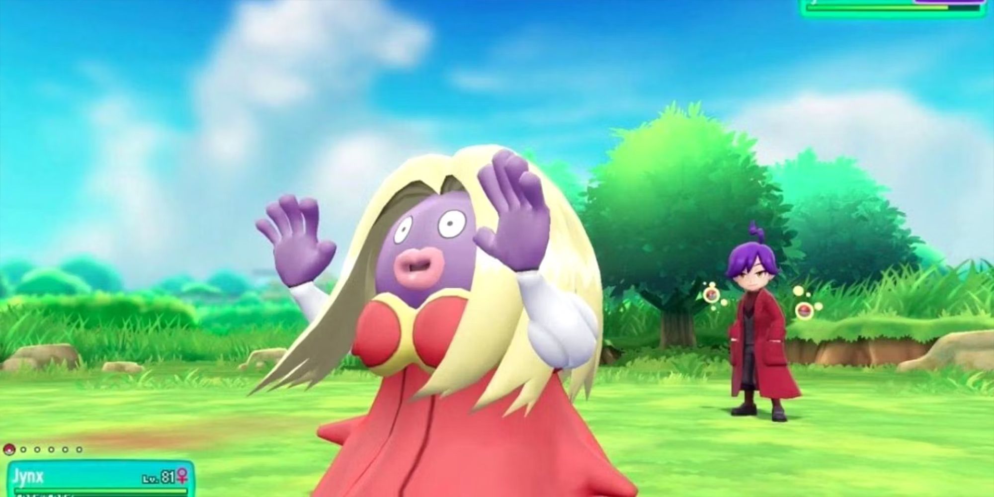
23 Jynx
A Controversial Design That Needed To Be Changed
- Generation 1
- First game introduced: Pokemon Red & Blue
Jynx's original design was so controversial that it had to be recolored, and it has not been a main feature in the anime since 2006. The less said about the original design the better, but even with its retouching, Jynx's design is still quite strange. It is too humanlike, complete with a dress and flowing blonde locks.
Human designs don't really work, and in Jynx's case, it's hard to deny. It was given a pre-evolution in Smoochum, and this works much better. Unsatisfied fans have even gone on to redesign this Pokemon themselves.
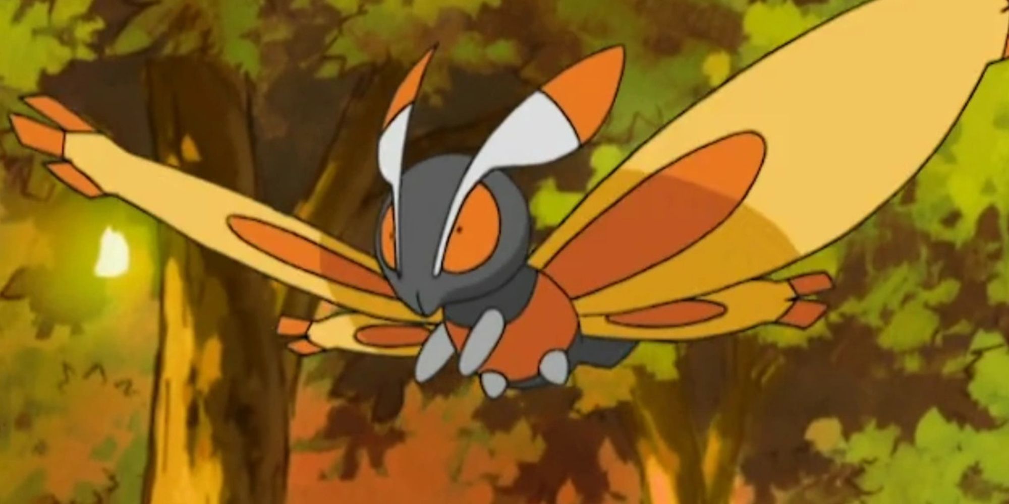
22 Mothim
A Forgettable Pokemon With A Plain Design
- Generation 4
- First game introduced: Pokemon Diamond & Pearl
There are several butterfly/moth Pokemon in the franchise (Butterfree, Venomoth, Beautifly, Vivillon, and so on), and all of them do a better job than Mothim. The Generation 4 Pokemon is just forgettable. It is part of a split evolution with Burmy and Wormadam, and gamers always prefer to go the Wormadam route, as it has more use in battle.
10 Things in Scarlet & Violet That Should Stay for the Next Mainline Pokemon Game
The tenth generation of Pokemon is sure to bring new gameplay mechanics, but what are some things they should carry over from Scarlet & Violet.This Pokemon is simply just a moth and not a clever interpretation of one, such as Frosmoth. The design seems lazy and is easy to forget when one considers the nicer designs of similar Pokemon in the series.
21 Slurpuff
A Truly Bizarre Pokemon
- Generation 6
- First game introduced: Pokemon X & Y
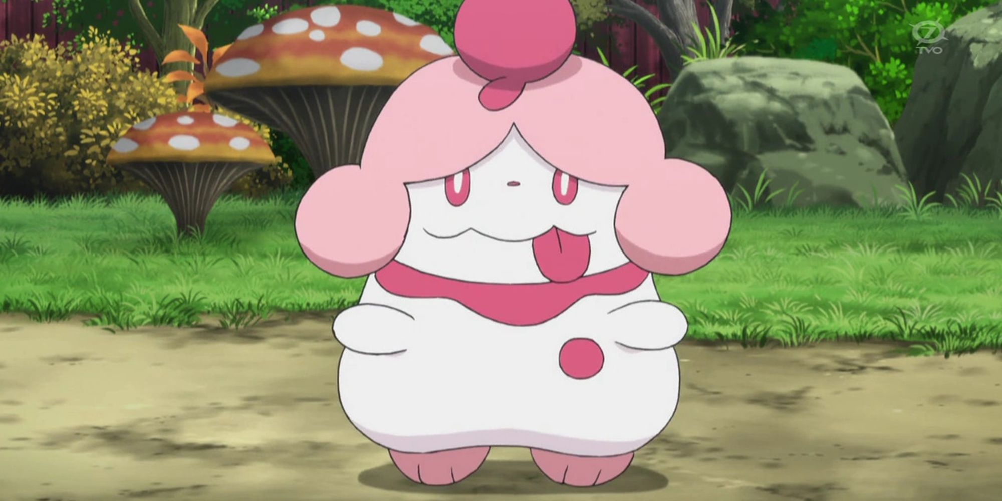
Generation 6 brought the Fairy-type and several different designs of Pokemon, mainly all that fit with the cute, pink aesthetic such as Slurpuff.
However, Slurpuff, along with its pre-evolved form of Swirlix, doesn't fit the cuteness that other Pokemon have. Their faces are silly and look pained. The fact it needs to be traded to evolve is a blessing, as few trainers will ever get the chance to use a Slurpuff and its derpy face. The Fairy-type has produced some amazing designs, but Slurpuff is not one of them.
20 Celesteela
A Complicated Mess
- Generation 7
- First game introduced: Pokemon Sun & Moon
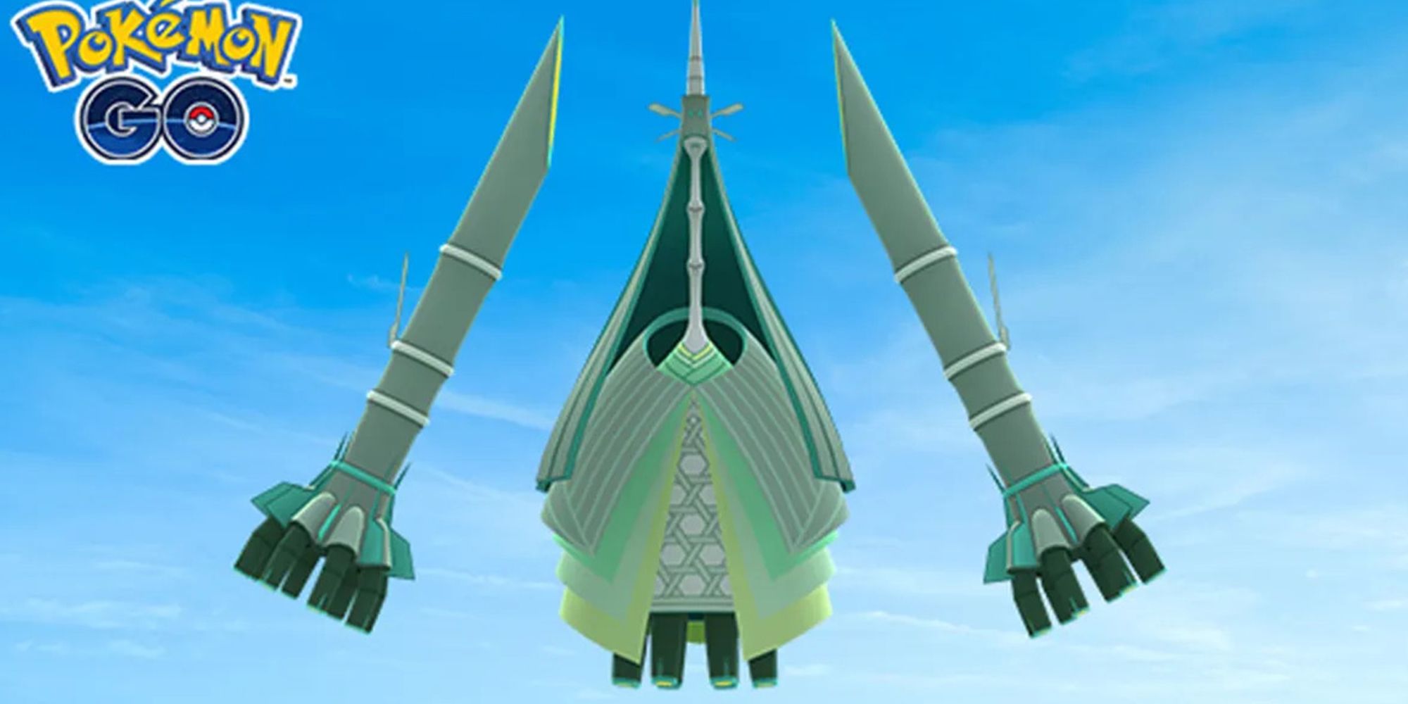
As a whole, the Ultra Beasts are horribly designed, although that may be the point, as they are from another dimension. Nonetheless, Celesteela is the worst of the bunch. Looking at it, it is hard to tell what it is meant to be, and it certainly does not look like a Pokemon.
Pokemon Scarlet And Violet: The Best Pokemon Not Included
Pokemon Scarlet and Violet doesn't include every Pokemon unfortunately, leaving players missing some of these great Pokemon.The arms on its side aren't attached and just look out of place, and its long thin neck and large body are disjointed. The whole design is bizarre and lacks clarity.
19 Eiscue
A Penguin With An Ice Cube On Its Head
- Generation 8
- First game introduced: Pokemon Sword & Shield
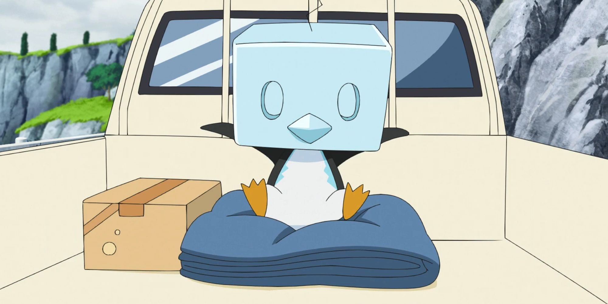
This Pokemon certainly has its fans, but in reality, it is just a penguin with an ice cube on its head. It is another example of a strange design choice, but again, this may be the point.
Thanks to its Ice Face ability, the ice cube on its head acts as a substitute, and it takes damage for Eiscue, but it reverts to its Noice Face form. This design is even worse as it is just a blue penguin head that doesn't even match the rest of the body. Although it is all for a gimmick, it just doesn't work.
18 Klink
A Strangely Simple Design
- Generation 5
- First game introduced: Pokemon Black & White
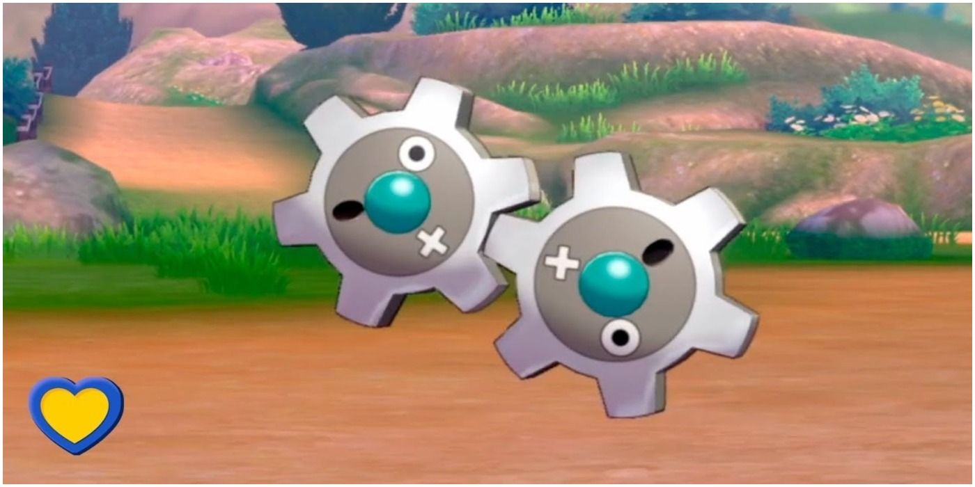
Klink feels like a cheap rip-off of Magnemite - an industrial-designed steel Pokemon that adds more heads with each evolution. Klink feels dull in this regard. Moving gears simply don't make for an interesting Pokemon design, and there isn't much of a twist in terms of what this Pokemon can do.
A member of the fifth generation, Klink is instantly one of the worst and most forgettable Pokemon designs.
17 Vanillite
A Flying Ice Cream Cone
- Generation 5
- First game introduced: Pokemon Black & White
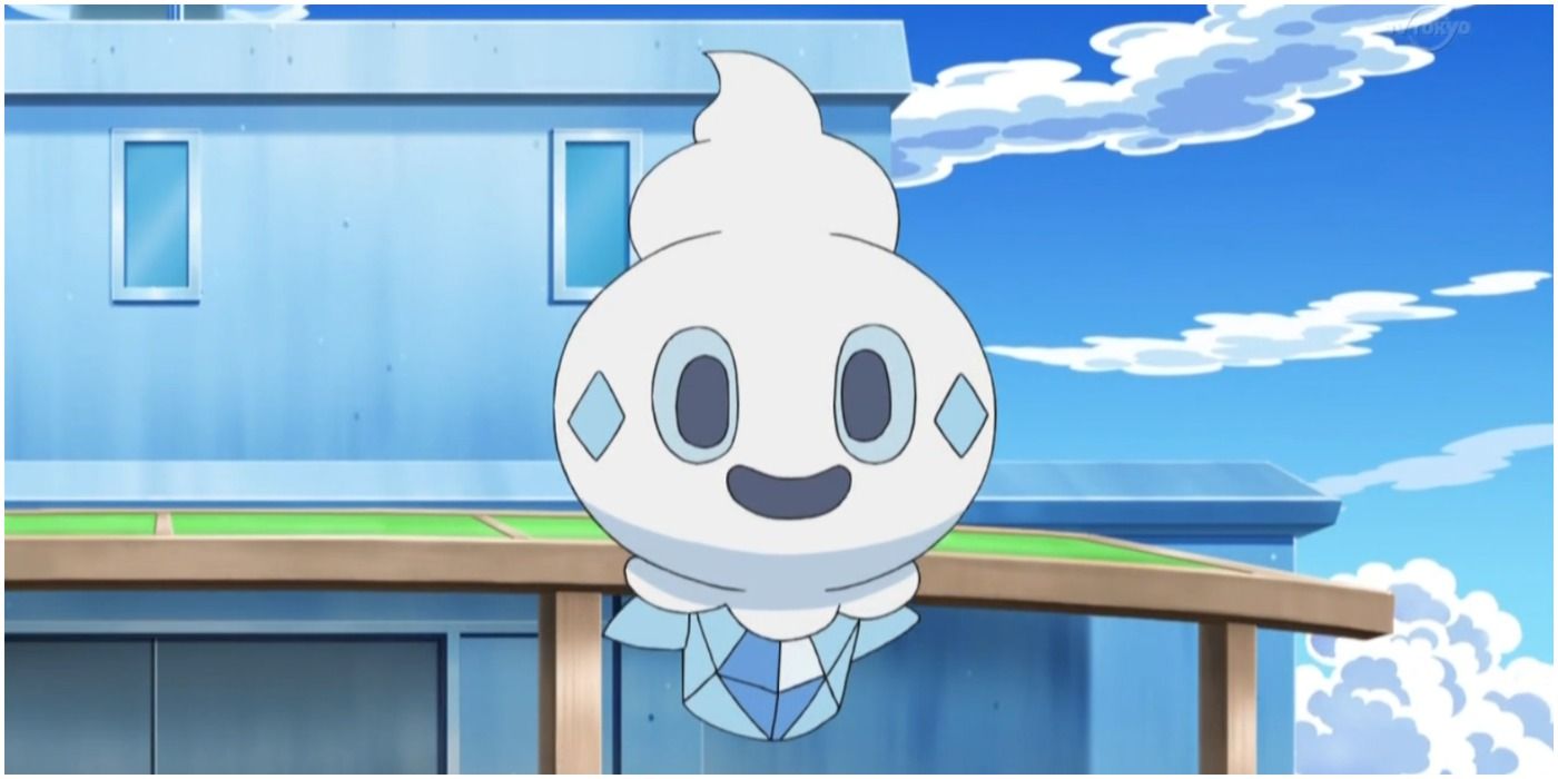
Food Pokemon are just weird, and Vanillite is one of the stranger variants designed for this category. A flying ice cream cone isn't exactly the most exciting or interesting Pokemon.
Fans have to wonder how the creature's designers came up with this one because it is really off-color for the series. Pokemon fans want their monsters to be cutting-edge and unique, not edible.
16 Luvdisc
An Oddly-Shaped Fish
- Generation 3
- First game introduced: Pokemon Ruby & Sapphire
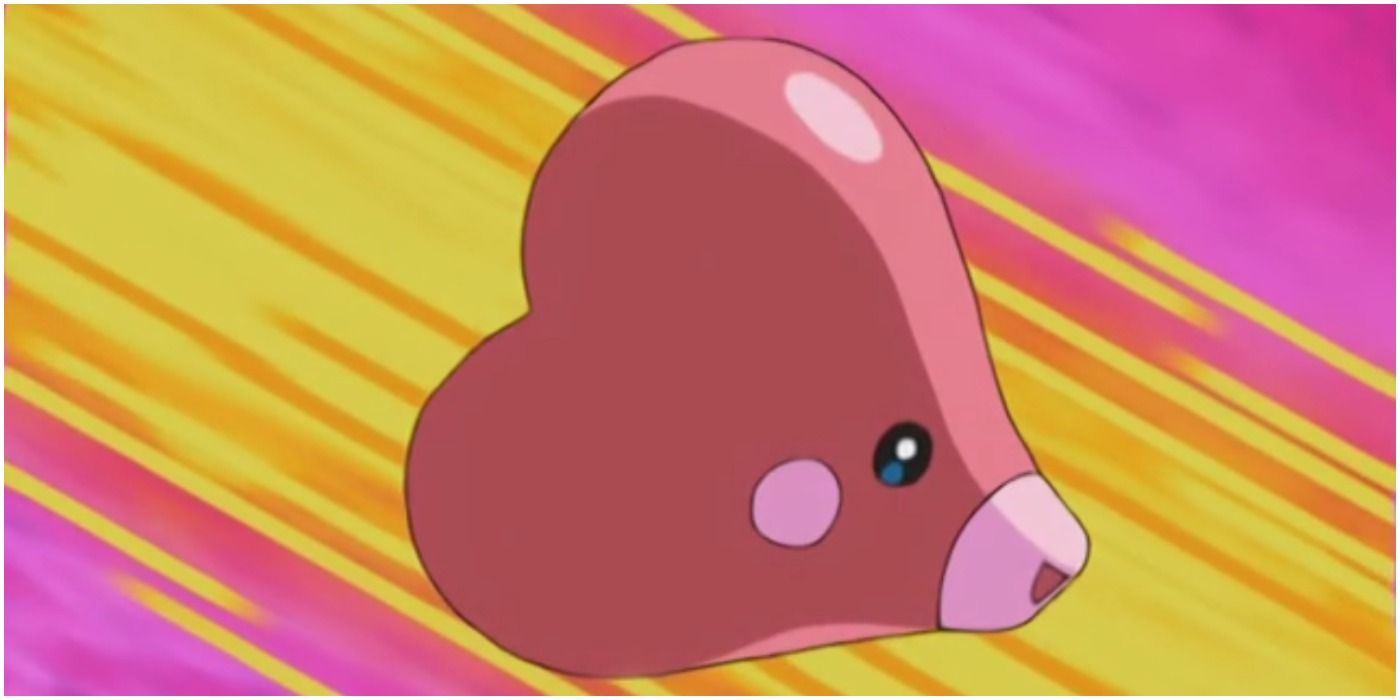
At least Luvdisc doesn't try to hide behind a cool-sounding name - it is literally a heart-shaped disc. A heart doesn't exactly invoke a sense of power or danger either, which makes it easy to categorize Luvdisc under the cute Pokemon section.
But Luvdisc isn't even that cute; it's just a pair of lips and eyes on a heart. It's neither compelling nor appealing as far as even the worst Pokemon designs go.
15 Manectric
A Somewhat Boring Design
- Generation 3
- First game introduced: Pokemon Ruby & Sapphire
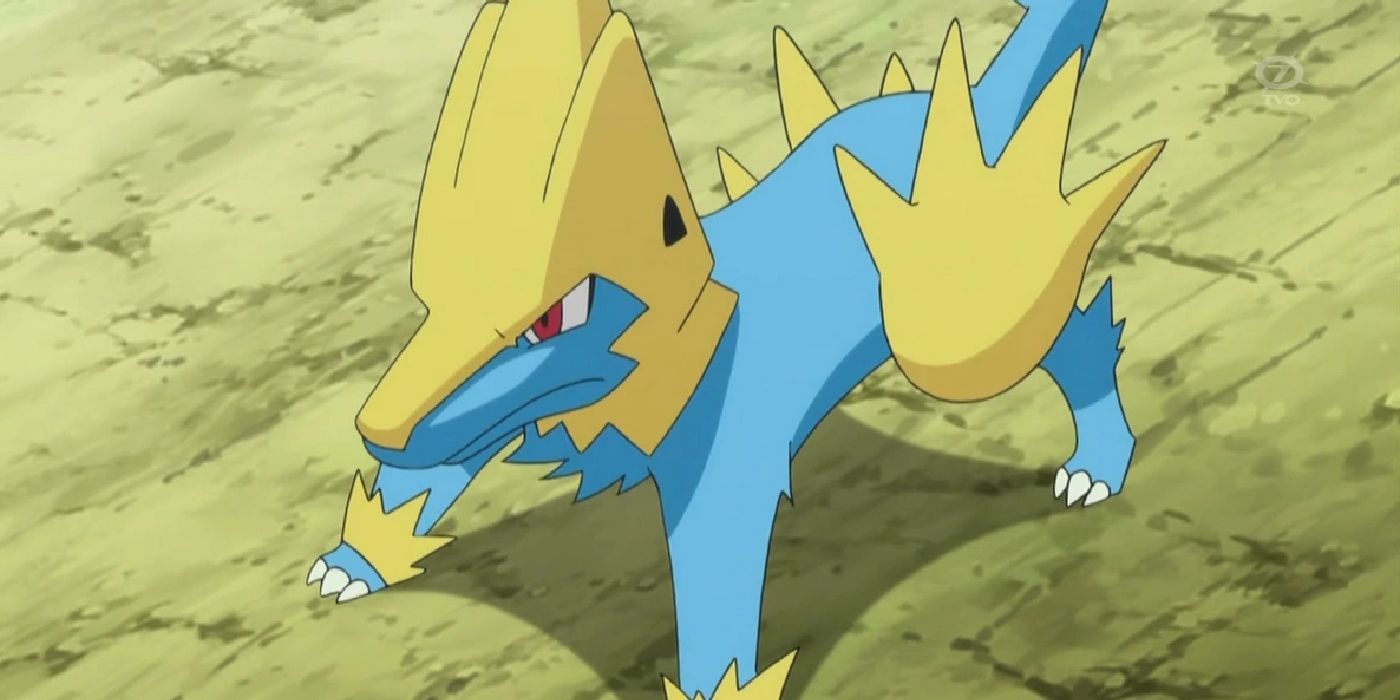
Manectric is another Pokemon that just feels unoriginal - as if several previous, better-designed Pokemon were scrapped for their parts to make an electric dog that was a significantly worse design.
Manectric might have some pretty cool moves, but its design is just odd. The giant pyramid on its head looks like a helmet and hair at the same time. The hand-shaped tail feathers are weird, too. Considering there was already an electric cat before, this Pokemon feels redundant.
14 Dedenne
A Poor Pikachu Clone
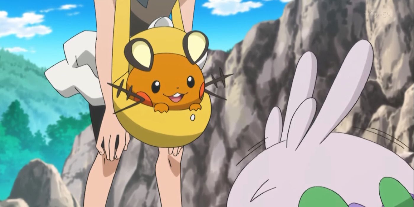
Dedenne is a cute electric mouse Pokemon that echoes physical similarities of Pikachu and Raichu just a little too much - it really feels like they just copied aspects from these two classic Pokemon to create a cuter version.
It's an overly simplistic design that comes off as slightly dull. That being said, Dedenne isn't the absolute worst-designed Pokemon; it's just a bland carbon copy of two of the best-known creatures in the series.
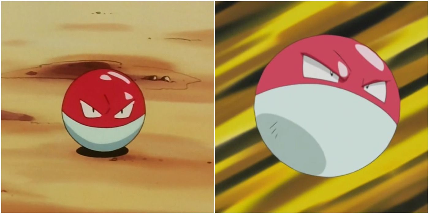
13 Voltorb
A Pokeball With Eyes
- Generation 1
- First game introduced: Pokemon Red & Blue
Kanto's designs are great, but there aren't too many standouts. The thing that works about Kanto's Dex is simplicity. Considering some of the beta designs, it's for the best they kept it simple with rats, birds, and the occasional oddity. Unfortunately, while most oddities are forgivable, Voltorb is just pure laziness.
Voltorb, in lore, is the result of a Pokeball being hit with a strong electrical impulse. There are some theories that it's also the result of a paranormal incident. Either way, it's an orb with an angry face. There are so many other more interesting electric types out there, even the literal magnets. Electrode is also pretty bad, but its smirk gives it a bit of charm.
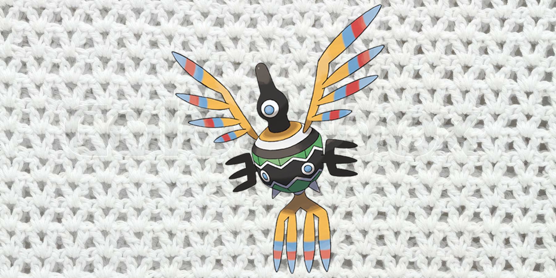
12 Sigilyph
A Very Confusing Design
- Generation 5
- First game introduced: Pokemon Black & White
If any generation gets ire for "bad designs," it's Gen 5. Unova's Pokedex was wildly inconsistent. Some additions were instant classics, and some were just head-scratchers. The biggest issue in their designs is how overly-designed they are, particularly the legendary Pokemon. However, designs like Sigilyph are also a bit much.
This psychic bird Pokemon is appropriately mystical in design, but there's just so much going on with it. It's hard to tell the head of Sigilyph from its tailfeathers. With so many clashing colors, it's not even internally consistent. The design can work in theory, but in practice, it's just far too bizarre. At the very least, it's surprisingly effective in combat.
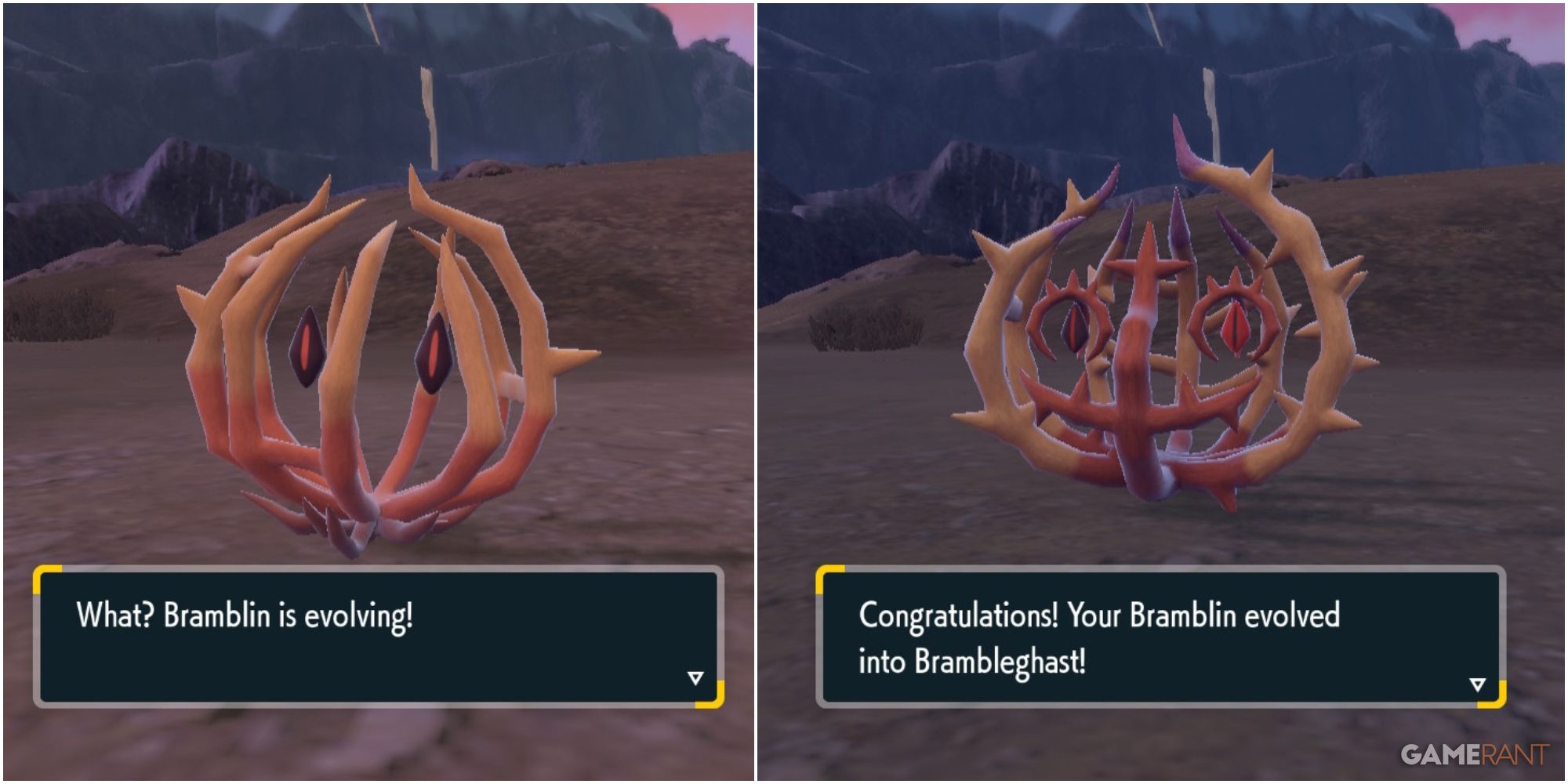
11 Bramblin
A Simplistic Design
- Generation 9
- First game introduced: Pokemon Scarlet & Violet
Bramblin is a strange concept, and although the design is charming in some respects, it feels a bit weak compared to many of the other Pokemon created in recent generations. At its core, Bramblin is nothing more than a rolling tumbleweed, given the Ghost and Grass-type moniker thanks to its sentient appearance in which two large seeds sit as eyes.
Even its evolution, Brambleghast, is simply a slightly detailed continuation of its base form, outlining the eyes more and making the tumbleweed shape a bit more pronounced. Bramblin is a novel idea but doesn't translate super well among the sea of more exciting options.
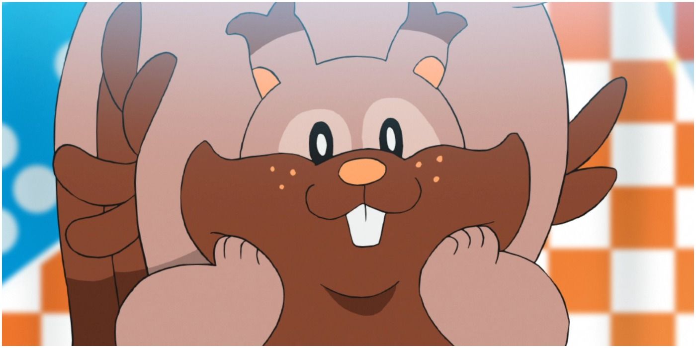
10 Greedent
A Run-Of-The-Mill Squirrel
- Generation 8
- First game introduced: Pokemon Sword & Shield
Some people may find this Pokemon more charming than awful, but Greedent absolutely has an uninspired design. This early-game normal-type shares similar attributes to the ones that came before it. However, in Sword and Shield, its appearance isn't one that's fun or exciting. Much like Raticate, it's just annoying to find.
Pokemon: 10 Normal-Types That Deserve A Second Typing
Some Normal Pokemon would really benefit from have a second type attached to them. Here are some prime candidates.However, it's hard to pin down exactly what about Greedent is so off-putting. When one considers a Pokemon like Gumshoes, for instance, it has a design and personality in it. Greedent is just a big squirrel. Its most unique trait is that it eats a lot of food. While relatable, that doesn't exactly make for a unique or interesting design.
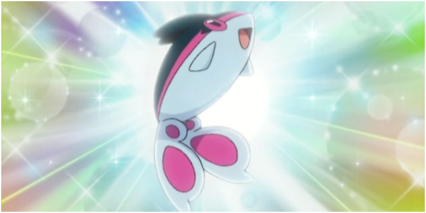
9 Lumineon
A Typical Fish
- Generation 4
- First game introduced: Pokemon Diamond & Pearl
Speaking of uninspired designs, Lumineon is absolutely one of the most snooze-worthy Pokemon. Finneon gets a pass because, despite being "just a fish," it's rather adorable. Lumineon is still cute, but it's also absolutely just a fish. In an ocean of water-types, why would any self-respecting trainer pick Lumineon?
Sinnoh has some incredible designs within the region. There's hardly a Pokemon that seems out of place or in the lower ranks of designs. The Burmy line gets a special mention, but they serve a purpose and are certainly unique. Lumineon is not that. The worst part: Lumineon isn't even worth using in battle. Other bland water-types have a niche, but Lumineon is just shark bait.

