File this under “things I had not even noticed let alone thought to ask”.
Over the weekend, Japanese developer Yuichiro Kitao (I am Setsuna, Crystar) pondered on Twitter why some Sega games had different coloured logos than others.
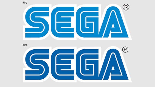
While this could have just been some idle observation, turns out he was onto something: Sega of America’s director of production Sam Mullen confirmed Kitao’s theory that, yes, Sega uses a different colour for its logo in Japan than it does everywhere else in the world.
The Japanese one is the lighter shade on top, while the international version is the darker logo below.
It’s not known why that’s the case, but the shift took place in the early 2000s, so you’ll only notice it on games released after Sega quit the hardware business. Mullen tells me he has some theories—from a printing mix-up to the Japanese shade being more kid-friendly—but in almost a decade’s service with Sega he’s never got an official explanation.
I want to believe that one day some intern saved the wrong color profile, the logos got split and ever since everyone has just run with it, assuming somebody made a call that nobody actually did.